Beat the Heat,
Long Island
Campaign identity and public awareness system for a heat-safety initiative that helps Long Island residents recognize, prevent and respond to heat-related illness.
Brand Identity
Campaigns
Digital Experiences
Civic & Public
Made with

About the project
Extreme heat is the deadliest weather hazard in the United States, and the hardest to see coming. The campaign needed to make an invisible threat impossible to ignore.


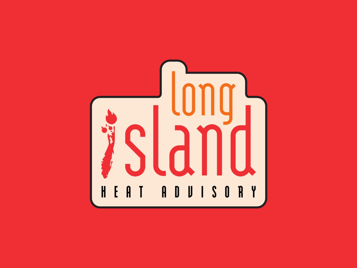


Primary horizontal and stacked lockups, shown in campaign yellow, alert red and warm cream. A contained badge version holds the mark together on busy photography.
The mark
The identity folds the island into the wordmark: the “i” becomes Long Island’s silhouette, with its tip set alight.
Color & type
Color moves like a heat index. Red, orange and yellow carry warnings and calls to action; a single cool blue is held back for relief.
Alert Red
HEX #EF4237
RGB 239 66 55
CMYK 0 89 84 0
Heat Orange
HEX #F57E23
RGB 245 126 35
CMYK 0 62 98 0
Sun Yellow
HEX #FDBE5B
RGB 253 190 91
CMYK 0 28 74 0
Relief Blue
HEX #3374BA
RGB 51 116 186
CMYK 82 52 0 0
Ink Black
HEX #000000
RGB 0 0 0
CMYK 75 68 67 90
Warm Cream
HEX #FDE7D5
RGB 253 231 213
CMYK 0 9 16 0
Headlines
Oswald
Aa
ABCDEFGHIJKLMNOPQRSTUVWXYZ
abcdefghijklmnopqrstuvwxyz
0123456789 !?&%
Body & interface
Barlow Semi Condensed
Aa
ABCDEFGHIJKLMNOPQRSTUVWXYZ
abcdefghijklmnopqrstuvwxyz
0123456789 !?&%
Oswald gives alerts the weight of a weather bulletin; Barlow Semi Condensed keeps health guidance readable at small sizes. Acumin Extra Condensed is reserved for large-format print headlines.
Campaign
A toddler flushed with heat rash is hard to look away from, and that discomfort is the point. The headline names the danger; the yellow band tells you what to do about it.


A2 posters. “She’s Burning Up Without a Word” leads with a deliberate fear appeal; “Feel the Heat? Beat It” is its typographic counterpart, carrying the heat-shimmer pattern used across the advertising.

Campaign imagery generated for concept purposes.
Online
The website is built around the four questions people ask in a heat emergency: what’s happening, who’s at risk, what do I do, and where do I go.


Campaign landing page: warning signs side by side, who is most at risk, everyday prevention and a cooling-center locator. Every section ends in an action.
300 × 250
160 × 600
728 × 90
Placeholder for animated IAB banner ads (After Effects / Lottie). Delete this section if the ads aren’t produced.
Project
Beat the Heat, Long Island
Type
Concept campaign
Sector
Civic & Public, Health
Disciplines
Brand Identity
Campaign
Web Design
Year
2026
Context
ART 437 Advertising & Branding,
Adelphi University
Design
Benjamin Eppel
Every summer, extreme heat puts Long Island’s most vulnerable residents at risk: young children, older adults, outdoor workers and people living alone. Most heat-related illness is preventable, but only if people recognize the warning signs and know where to turn. Beat the Heat, Long Island is a public awareness campaign that gives the region one clear, trustworthy voice for heat safety across outdoor, print and digital media.
The ask
The campaign needed to reach a broad public, from parents and caregivers to seniors, coaches and beachgoers, and do three things at once: teach people the signs of heat exhaustion and heat stroke, encourage everyday prevention, and point them toward cooling centers and emergency resources. The voice had to stay calm and community-minded while still creating the urgency that gets people to act.
An island on fire
The identity is built on a single gesture. In the wordmark, the “i” of “island” is redrawn as the shape of Long Island, its tip turned into a flame: a local mark people can read at a glance, and one that says what the campaign is about before any copy does. A condensed wordmark keeps lockups compact enough for bus shelters, banner ads and phone screens, with horizontal, stacked and badge versions so the mark holds up at every scale.
A palette that sounds the alarm, and offers relief
Color moves like a heat index. Red, orange and yellow carry warnings and calls to action, and black keeps information authoritative. A single cool blue is held back for relief: cooling centers, maps and places to go. Oswald’s bold condensed headlines give alerts the weight of a weather bulletin, while Barlow Semi Condensed keeps health guidance easy to read for every audience.
Campaign
The A2 posters work as a pair. “She’s Burning Up Without a Word” uses a deliberate fear appeal: the image stops you, and the yellow band below turns that attention into a single action, Know the Signs. “Feel the Heat? Beat It” is the typographic counterpart, its heat-shimmer pattern recurring across the advertising and legible from across a street or platform. Outdoor placements put the campaign where heat actually happens, in the neighborhoods themselves.
Online
The campaign website turns the identity into a resource. It opens with the same headline as the posters, then moves through the warning signs of heat exhaustion and heat stroke side by side, who is most at risk, simple prevention habits and a cooling-center locator. Every section ends in an action, from “Call 911” to “Check on your neighbors.”
Built for the next heat wave
Beat the Heat, Long Island treats heat safety as a shared responsibility rather than a seasonal warning. The system is designed to switch on whenever an advisory does: one recognizable mark, one consistent voice and a clear next step at every touchpoint.
Menu
Beat the Heat,
Long Island
Campaign identity and public awareness system for a heat-safety initiative that helps Long Island residents recognize, prevent and respond to heat-related illness.
Brand Identity
Campaigns
Digital Experiences
Civic & Public
Made with
About the project
Extreme heat is the deadliest weather hazard in the United States, and the hardest to see coming. The campaign needed to make an invisible threat impossible to ignore.
Primary horizontal and stacked lockups in campaign yellow, alert red and warm cream, plus a contained badge for busy photography.
The mark
The identity folds the island into the wordmark: the “i” becomes Long Island’s silhouette, with its tip set alight.
Color & type
Color moves like a heat index. Red, orange and yellow carry warnings and calls to action; a single cool blue is held back for relief.
Alert Red
#EF4237
Heat Orange
#F57E23
Sun Yellow
#FDBE5B
Relief Blue
#3374BA
Ink Black
#000000
Warm Cream
#FDE7D5
Headlines — Oswald
Aa
ABCDEFGHIJKLMNOPQRSTUVWXYZ
abcdefghijklmnopqrstuvwxyz
Body & interface — Barlow Semi Condensed
Aa
ABCDEFGHIJKLMNOPQRSTUVWXYZ
abcdefghijklmnopqrstuvwxyz
Campaign
A toddler flushed with heat rash is hard to look away from, and that discomfort is the point. The headline names the danger; the yellow band tells you what to do about it.
A2 posters: a deliberate fear appeal, and its typographic counterpart carrying the campaign’s heat-shimmer pattern.
Campaign imagery generated for concept purposes.
Online
The website is built around the four questions people ask in a heat emergency: what’s happening, who’s at risk, what do I do, and where do I go.
Campaign landing page. Every section ends in an action.
300 × 250
Placeholder for animated IAB ads. Delete if unused.
Type
Concept campaign
Sector
Civic & Public, Health
Disciplines
Brand Identity, Campaign, Web Design
Year
2026
Context
ART 437 Advertising & Branding, Adelphi University
Every summer, extreme heat puts Long Island’s most vulnerable residents at risk: young children, older adults, outdoor workers and people living alone. Most heat-related illness is preventable, but only if people recognize the warning signs and know where to turn. Beat the Heat, Long Island is a public awareness campaign that gives the region one clear, trustworthy voice for heat safety across outdoor, print and digital media.
The ask
The campaign needed to reach a broad public, from parents and caregivers to seniors, coaches and beachgoers, and do three things at once: teach people the signs of heat exhaustion and heat stroke, encourage everyday prevention, and point them toward cooling centers and emergency resources. The voice had to stay calm and community-minded while still creating the urgency that gets people to act.
An island on fire
The identity is built on a single gesture. In the wordmark, the “i” of “island” is redrawn as the shape of Long Island, its tip turned into a flame: a local mark people can read at a glance, and one that says what the campaign is about before any copy does. A condensed wordmark keeps lockups compact enough for bus shelters, banner ads and phone screens, with horizontal, stacked and badge versions so the mark holds up at every scale.
A palette that sounds the alarm, and offers relief
Color moves like a heat index. Red, orange and yellow carry warnings and calls to action, and black keeps information authoritative. A single cool blue is held back for relief: cooling centers, maps and places to go. Oswald’s bold condensed headlines give alerts the weight of a weather bulletin, while Barlow Semi Condensed keeps health guidance easy to read for every audience.
Campaign
The A2 posters work as a pair. “She’s Burning Up Without a Word” uses a deliberate fear appeal: the image stops you, and the yellow band below turns that attention into a single action, Know the Signs. “Feel the Heat? Beat It” is the typographic counterpart, its heat-shimmer pattern recurring across the advertising and legible from across a street or platform. Outdoor placements put the campaign where heat actually happens, in the neighborhoods themselves.
Online
The campaign website turns the identity into a resource. It opens with the same headline as the posters, then moves through the warning signs of heat exhaustion and heat stroke side by side, who is most at risk, simple prevention habits and a cooling-center locator. Every section ends in an action, from “Call 911” to “Check on your neighbors.”
Built for the next heat wave
Beat the Heat, Long Island treats heat safety as a shared responsibility rather than a seasonal warning. The system is designed to switch on whenever an advisory does: one recognizable mark, one consistent voice and a clear next step at every touchpoint.
Next project
Riptide Energy
Brand identity and custom typeface for an energy drink.